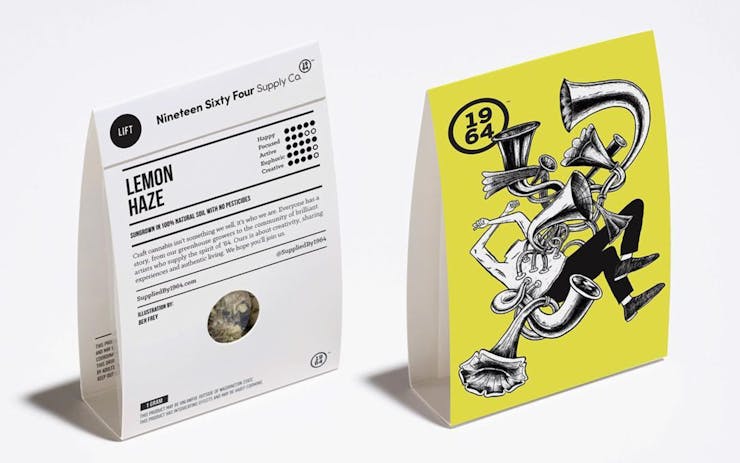
Once a month, Leafly chats with an artist working in the creative side of cannabis—packaging and design. This month’s subject: Vancouver-based designer Ben Frey, who’s worked on packaging for 1964 Supply Co.
LEAFLY: Tell us about the assignment.
BEN FREY: 1964 Supply Co. reached out to the ad agency 123west about branding their company and also coming up with a concept with their packaging. 123west came up with the idea to get some of the world’s top illustrators to make a creative experience on the high of several different strains that 1964 procured. I was given Lemon Haze, along with a creative brief, like most design or illustrations, that outlined the description of the strain, but ultimately, it was open for interpretation.
“Around the time of putting ideas together (for Lemon Haze), I was in and out of a lot antique stores.”
Lemon Haze is a high energy strain so I wanted to capture something uplifting and motivating. Around the time of putting ideas together, I was in and out of a lot antique stores. There were these beautiful gramophones on display and each one’s horn was unique in style and finish. The curves in the horns got me thinking of an image where all these gramophones were intertwined and resonating good energy. And then I figured I could portray this kind of energy of light and love being emitted from the body and it would represent the euphoric and optimistic feeling that Lemon Haze brings.
I had other ideas, but they weren’t as strong. There was one with puckered, sour faces moving through a space vortex with a zeppelin floating past. Synchronized swimmers forming a pattern in the middle of a flower. An eagle talon carrying a torch.
Have you experienced any pushback within your industry for devoting your skills to cannabis?
I wish I could say it was dramatic, but I had zero pushback from any of my peers, the design community, or anyone else for creating art to sell cannabis. I’ve had nothing but positive feedback about the project. I think that because cannabis is right on the verge of being legalized in Canada, there’s way less of a stigma attached to it than, say, 10 years ago.
123w’s involvement also was a big part of that, too. They understood who 1964’s market was and designed this whole packaging concept to be contemporary, and not fall on overused images of skunks or lions smoking big blunts. They wanted to create a line that would be like the craft beer of cannabis. I’m an illustration instructor at Capilano University’s School of Design, and my colleagues like to show cannabis packaging as examples of good design. So, yeah, no pushback.
What’s your personal relationship to cannabis?
I don’t use cannabis daily, only recreationally. What I enjoy most when I’m smoking is to listen to my records and get real focused on the mix of a song, or the layered tracks. I know it’s pretty cliché, but I love doing that with Steely Dan’s Aja. I’ve listened to that record hundreds of times, but I still love how perfect that album is. It’s a real sound bath.
I’d say my favorite strain would be White Widow. It’s the best social strain in my opinion. I can smoke and hold conversation without losing my train of thought or getting distracted, which happens with other strains.
Who’s your favorite designer or illustrator?
That’s tough! I look up to many artists that do murals, User Interface (UI) design, motion graphics, tattoos, and illustration—people like Joe Sacco, Michael Reeder, Christian Lanouette, Tyler Keeton Robbins, Piet Parra and John Holcroft.
What’s your least favorite commercial design?
I don’t mind the style of UI design, illustration, and iconography when it comes to viewing on screen—it simplifies and enhances your user experience. But I despise seeing that style implemented elsewhere—like in beer labels or murals or print ads. I like keeping what I see on devices and the real and tangible separate.


